Grabyo – Global Brand Development
Refine the brand direction and all marketing/sales visuals to assist in driving the Grabyo brand in a direction defined by key stake holders.
Live video production in a browser-based workspace.
Global Brand Development
Developing Grabyos’ Global Visual Branding
Grabyo
Role:
Lead Creative Designer
Project Lead
Tools (naming a few..)
Figma (Design)
Miro (Workshops)
After effects (Animation)
Industry
Cloud Video Production
SaaS

Project Overview
Refine the brand direction and all marketing/sales visuals to assist in driving the Grabyo brand in a direction defined by key stake holders. Develop an animated tone of voice suited to the re-brand that can be used for marketing innovation and external campaigns
Following an extensive brand audit, multiple research phases were undertaken with key leadership to understand the company’s road map and trajectory. Extensive competitor research was used to understand direct competitors and their visual positioning within the market.
About the Project
Development and refinement of the current brand across all external facing visuals. Build a new animated tone of voice to be original and stand out for any outward facing or innovative campaigns.

Develop Global Brand
Discuss with key stakeholders the future value of the business to ensure the new branding assets align with all views.

Competitor Audit
Understand the current market to ensure originality of the new brand to drive a visual contrast in a competitive market.

Refined Content
Create and introduce the new visual understanding of animation and videography to be used globally in campaigns and other material

Implementation
Identify all areas of misalignment and implement designs and processes to drive a segmented approach of visual change.
Understanding Grabyo
Grabyo Mission Statement
“Our mission is to simplify video production and make it accessible to everyone. We want to provide a platform that lets anyone create high-quality videos without access to lots of expensive hardware or years of training.”
“Our vision is to take all of the features and functionality of complex video production equipment, and make it easy to use and available everywhere.“
Tone of voice
“The way we speak to the world is informal but assured. The media industry is about entertainment and fun – and the technology world is about innovation and results. We strike the balance between these two worlds”
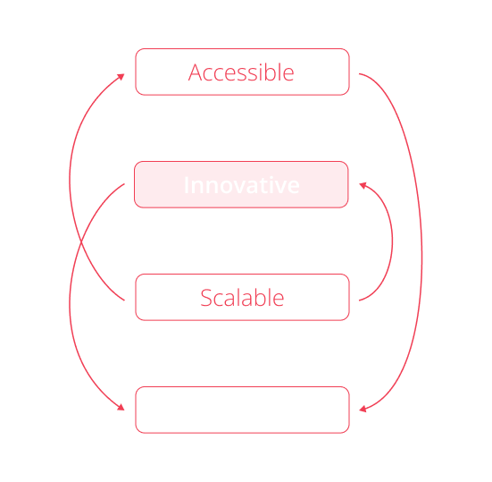
Brand Atoms ✍🏻
Colours
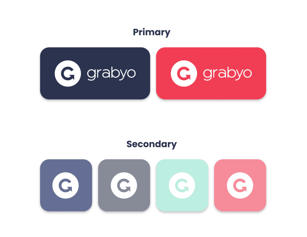
To not cause confusion with existing customers two primary colours were chosen as drivers for the refinement, secondary derivates were attained from the product’s design system to build a consistency between the product and marketing assets.
Accessibility testing was undertaken and rules generated to ensure no mistakes were placed into designs.

Patterns & Textures
Textures were obtained by generating derivates from the graphic marker and creating lines in parallel to drive the notion of motion/movement. These were only to be used when visual noise was needed, building a more exciting and vibrant visual asset when required.
Iconography
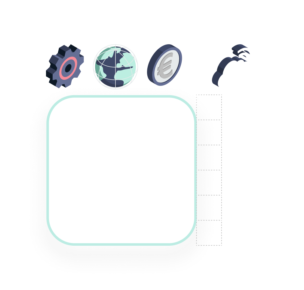
2 styles of icons were used within the marketing assets to aid a better visual notion. 3D assets were used to give an underlying subconscious understanding of what the topic of an asset would be; technical, monetary, benefits ect
These icons were chosen to align with the animated assets containing CGI, pulling in a 3D aspect.
Visual Assets
Marketing Materials
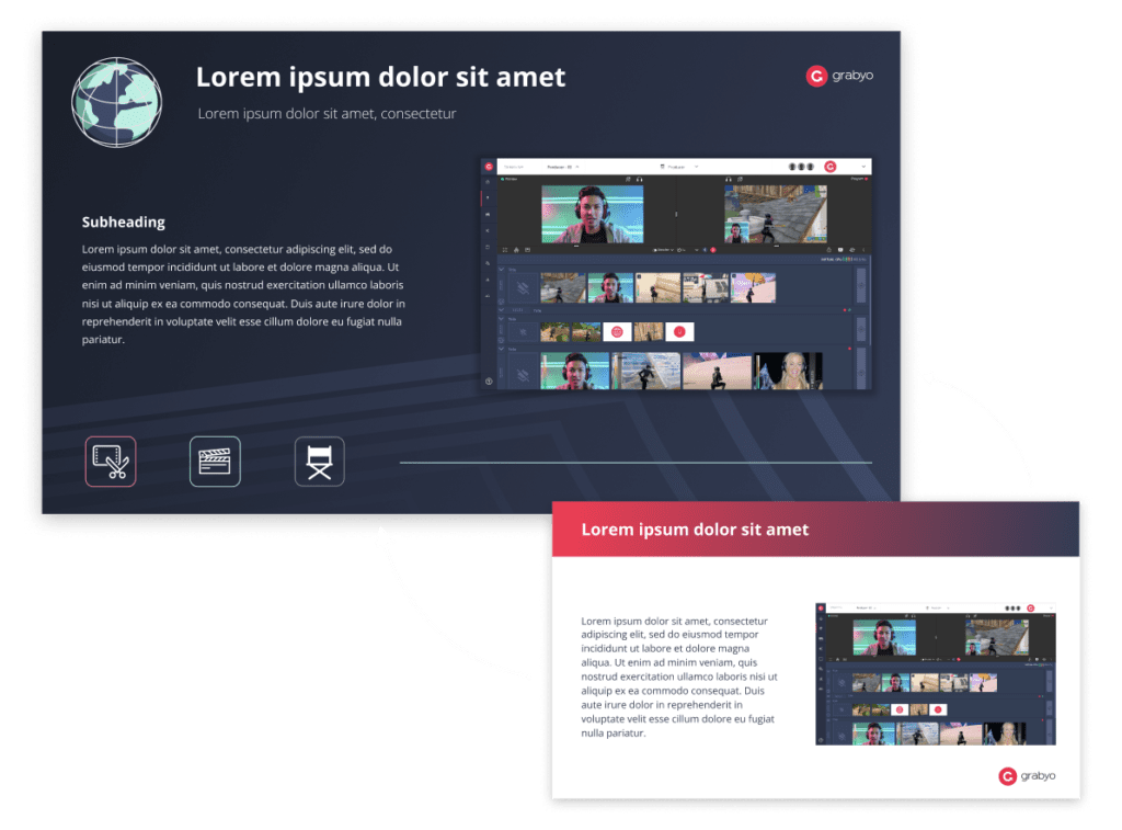
Marketing templates were generated running through all visual assets to drive a more innovative and forward thinking brand that can be shown to customers and clients alike.
Using Blue as the primary colour allowed for a more refined, yet playful look to be juxtaposed, whilst the secondary colours pulled the viewer’s eye through the page.
Website Design
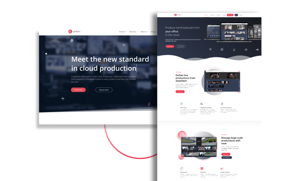
All elements of the brand development were integrated to the website re-build and launched together.
The full website case study can be found in the link below.
Animated Tone of Voice
3 styles of video were determined to be most versatile to suit the brand and its objectives: full commercials, explainer videos and abstract use cases.
Full commercials used an array of complex videography and CGI to create an understanding of which physical product has been converted into a cloud-based platform.
Explainer videos were created to give a larger understanding of how the complex UI could be used, to suit one’s workflow to generate a desired outcome.
Abstract use cases were created to demonstrate the benefits certain features may give to a user where it’s difficult to visualise their functionality
{Full Commercial}
Feature based – Grabyo Audio mixer
{Explainer Video}
UI Based – Grabyo Control Room
{Abstract Use Case}
Workflow Monetisation – Grabyo Clipping

