Thomas International Global Brand Alignment
Aligning the Thomas brand to create an original and understandable customer experience which combines all of Thomas’ brand values.
Psychometric assessment platform for recruitment and development
Global Brand Alignment
Bringing synergy between product and brand
Thomas International
Overview
Involve key stakeholders to align the Thomas brand to create an original and understandable customer experience which combines all of Thomas’ brand values.
To shape the future of Thomas and align the brand with the overarching company vision, I assessed all facets of the organization. This involved implementing the branding across all platforms and non-platform assets, incorporating insights and perspectives from stakeholders, including senior leadership and board members.
About the project
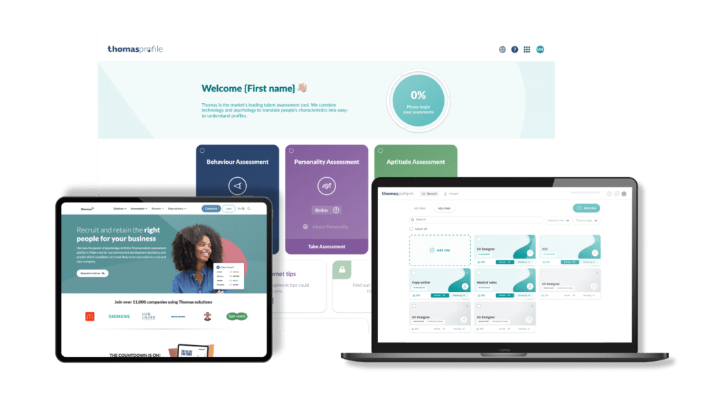
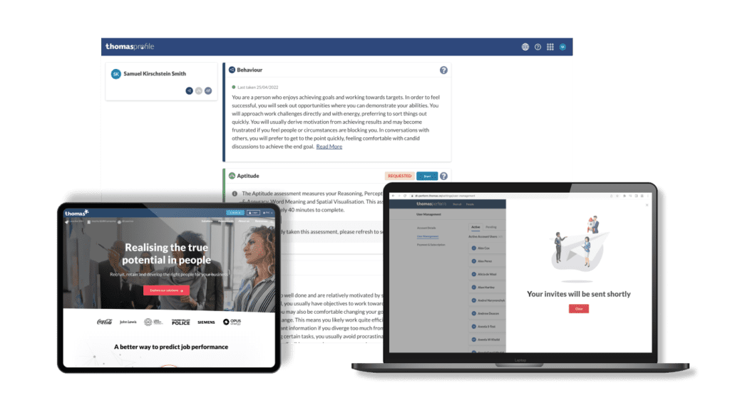
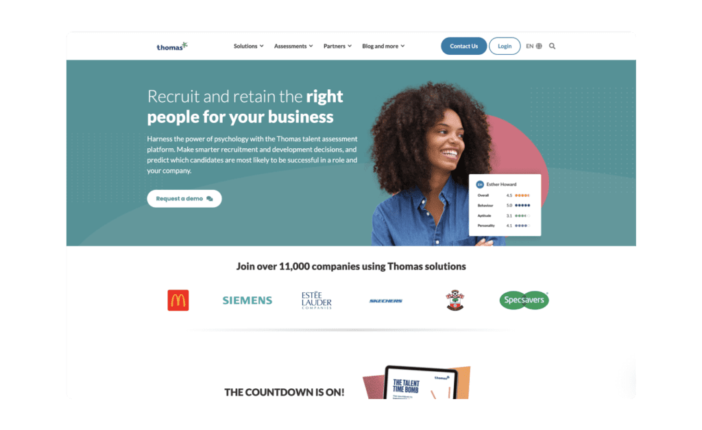
Collaborating as a cross-functional team of marketing and product designers, I aligned the visual journey across all of Thomas’ products and platforms. This effort aimed to create a more refined user experience, addressing customer confusion identified through user research.




Align Global Brand
Facilitated discussions with key stakeholders to explore both the historical and future value of the business, ensuring that the new branding aligns with diverse perspectives and insights.


Competitor Audit
Conducted a thorough analysis of the current market to ensure the originality of the new brand, creating a distinct visual contrast that stands out in a competitive landscape.


Modernise
Refined the brand to ensure it is future-proof, designed to remain relevant and effective for three years or more during Thomas’s growth phase.


Implementation
Identified areas of misalignment and implemented targeted designs to drive a segmented approach to visual change, ensuring a cohesive brand experience.
Branding Process ✍🏻
Establishing a Strong Foundation for the Rebrand
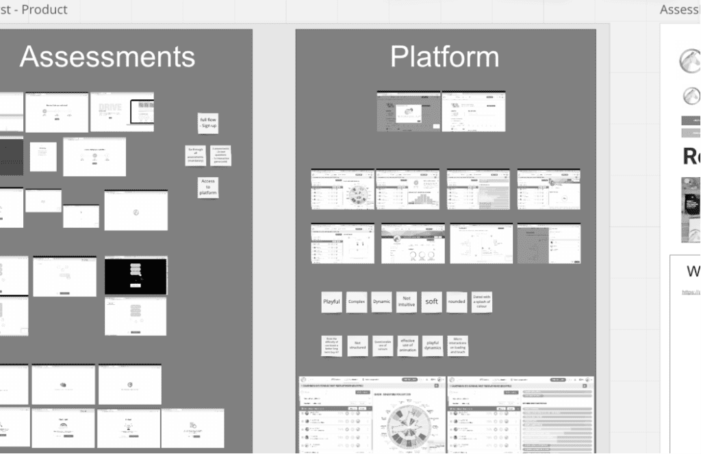
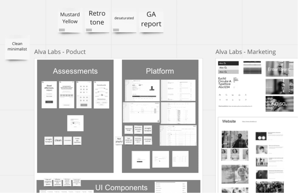
To ensure the rebrand was built on solid foundations, we conducted comprehensive competitor research that examined not only branding essentials like colour, typography, and values but also identified visual gaps in the market. By incorporating contemporary design trends, we discovered a significant opportunity in clean, minimalistic aesthetics characterised by soft-touch, vector-based designs, vibrant colours, and ample white space.



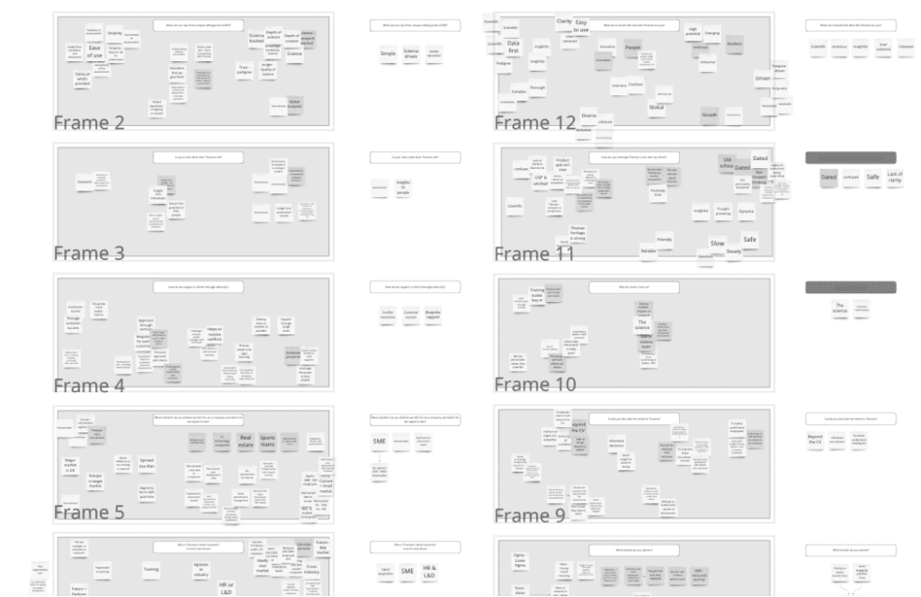
Stakeholder interviews for insightful alignment
Thirteen individual interviews were conducted with all senior leadership team members and key employees to identify sources of misalignment and gain insights into the business from their perspectives.
The anonymised data collected provided valuable information and was compiled for review. Each interview featured a consistent set of linear and abstract questions exploring the past, present, and future of the business.
The data was interpreted to inspire creative approaches that aimed to elevate the brand while ensuring existing customers remained engaged and valued.
Streamlined collaboration with a focused roadmap
To facilitate effective collaboration within the cross-functional team, we established a tight roadmap to ensure project completion within two months. This included weekly workshops to drive progress and support research efforts within the marketing teams.
Once all research was collected, I conducted three major remote workshops to stage the redesign process, fostering idea generation through a bottom-up approach. These structured processes were crucial for keeping stakeholders informed of progress and design rationale at each stage.




Visual Assets ✍🏻

Guiding decisions with key brand phrases
Following the stakeholder interviews, I identified key phrases to guide decision-making, including:
- Scientific
- Ambitious
- Insightful
- User-Centered
- Unbiased
- “A smart approach-able person”
- Modern
These phrases served as crucial benchmarks for evaluating ideas; if a concept didn’t align with these values, it was deemed unsuitable for the brand. All inspiration and mood boards were developed in line with these key attributes.
Streamlining the colour palette for clarity
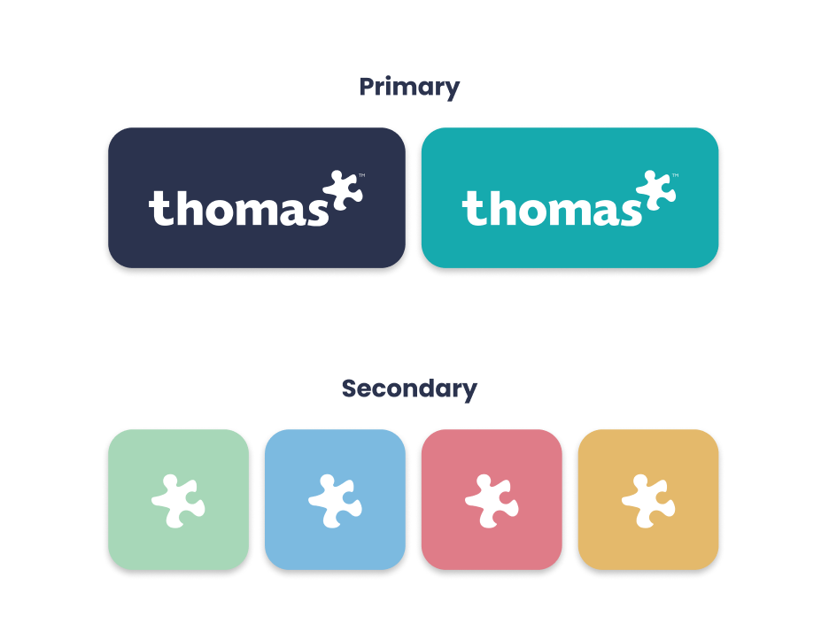
The colour palette was refined from the previous 18 colours, which led to widespread confusion, down to six key entities (two primary and four secondary) along with a selection of grey tones. Each colour was chosen as a more vibrant variant of an existing hue, aligned with the revised brand values:
- Midnight = Strength
- Teal = Smart
- Mint = Friendly
- Sky = Calm
- Coral = Passion
- Mustard = Positive


Enhancing Visual Depth with a Vector-Based Approach
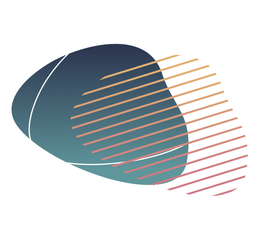
We employed a vector-based approach, utilizing patterns and organic shapes to add depth to graphic elements. The incorporation of thin, straight lines reinforced the modern and sleek aesthetic we aimed to achieve.
This minimalist style extended to the product iconography, contributing to a clean and refined appearance that communicated trust and strength across all design elements.
Emphasising approachability with natural imagery
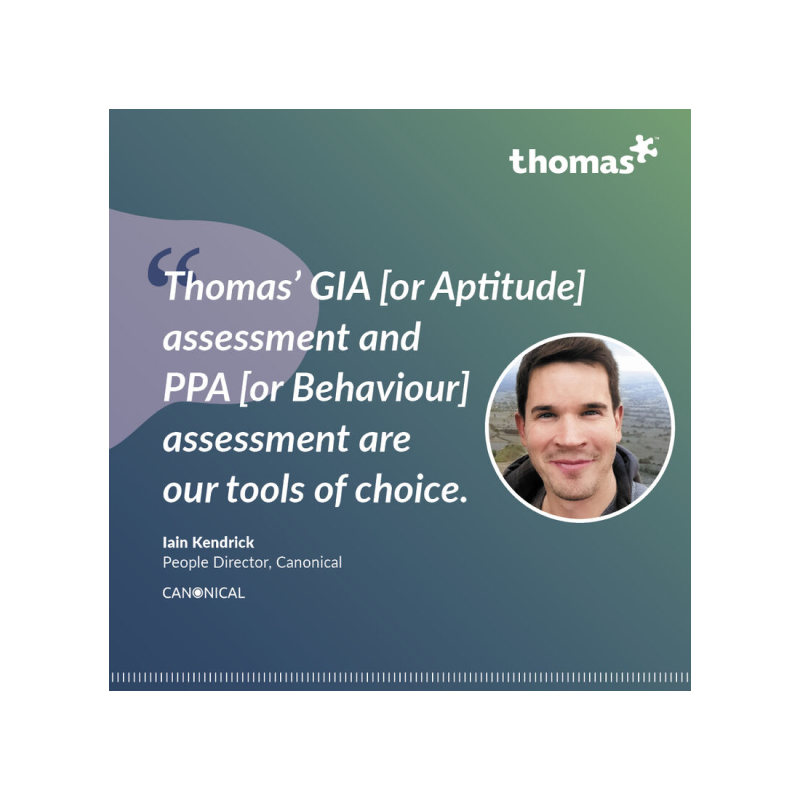
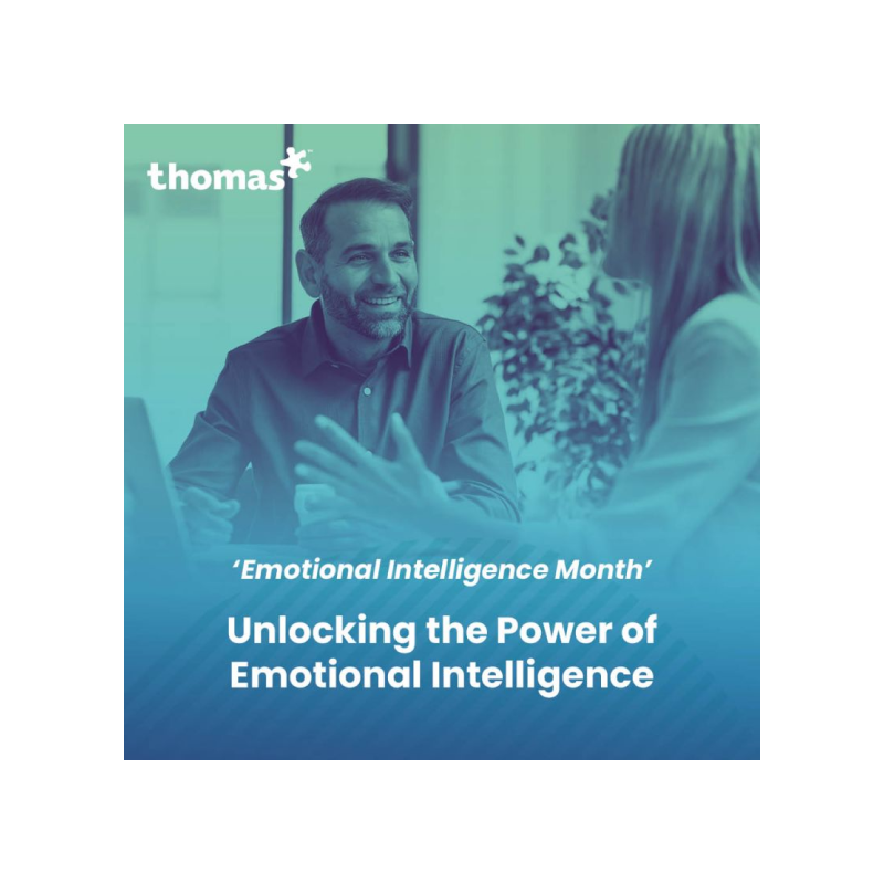
To enhance marketing assets, we transitioned from heavily staged stock imagery to friendly, natural visuals. This shift made the brand feel more approachable and engaging, resonating with a broader audience.


Video/Animation
To fully embrace the new branding, I incorporated animated elements that aligned with the visual style and tone of voice. This approach allowed us to enhance user engagement and create a dynamic brand presence.
I employed a 2D vector-based technique to develop clean, streamlined animations that captivated audiences, even without audio. This choice not only reinforced the brand identity but also ensured that the animations were visually appealing across different contexts.
These animations were designed with various use cases in mind—encompassing the public website, social ads, and in-product experiences—while maintaining consistency with the newly implemented UI. This comprehensive strategy aimed to enhance user interaction and strengthen brand recognition.
Establishing a Future-Proof Design Process
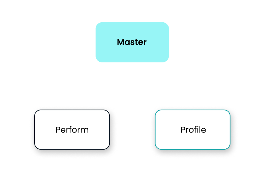
To facilitate a cleaner design process and future-proof the business’s branding implementation, we introduced three design systems based on the atomic design structure. A master design system was created to encompass all key brand elements, including colors, grids, icons, shadows, and more. This foundational system ensured consistency across the brand while serving as a reference point for all design work.
In addition to the master system, we developed sub-design systems tailored for each product, allowing for variations in design styles while maintaining alignment with the overarching brand identity. This structured approach provided greater flexibility and oversight, enabling teams to effectively manage the components used across different projects, ultimately enhancing brand coherence and consistency.

About Thomas International
Thomas International is a leader in psychometric analysis, dedicated to helping businesses make informed and strategic hiring decisions. By leveraging scientifically robust and inclusive insights, Thomas International empowers organisations to connect with their workforce more effectively and enhance overall team dynamics.
In 2022, Thomas International underwent a comprehensive rebranding effort, reflecting their commitment to innovation and excellence. Since then, they have been pushing new boundaries in the field, continually advancing their methodologies and expanding their impact.
To learn more about their groundbreaking work and how they can support your business, visit their website here.
Old vs New 👁👁


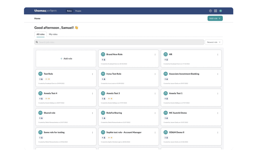
{Product – Perform}
Candidate Analysis

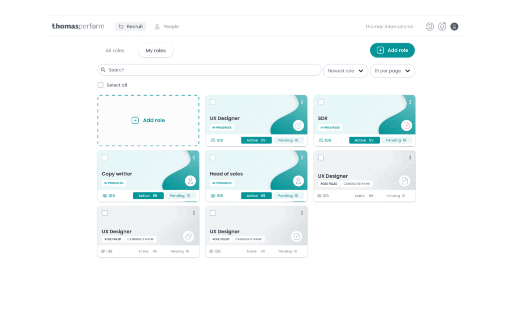

{Product – Profile}
Candidate Experience
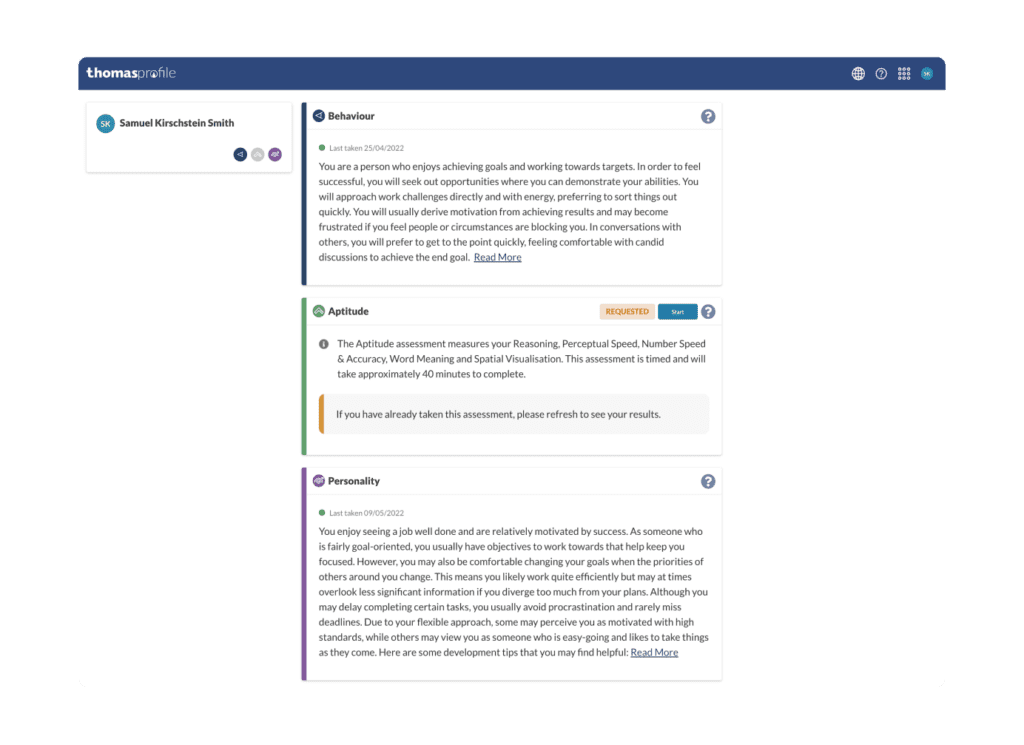

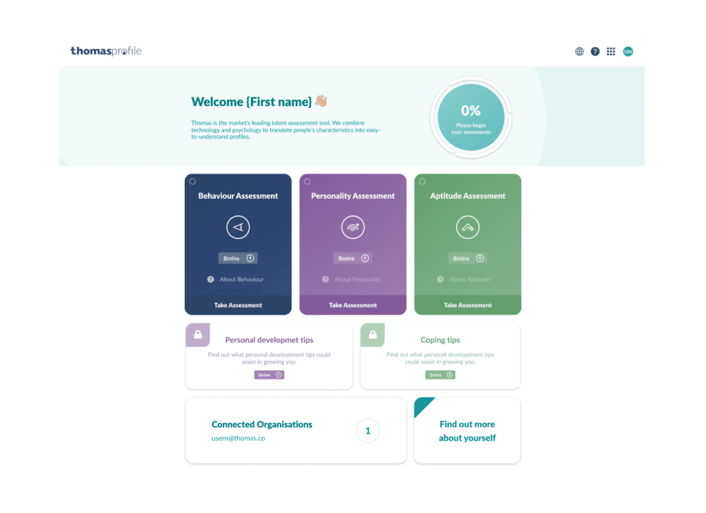

{Website}
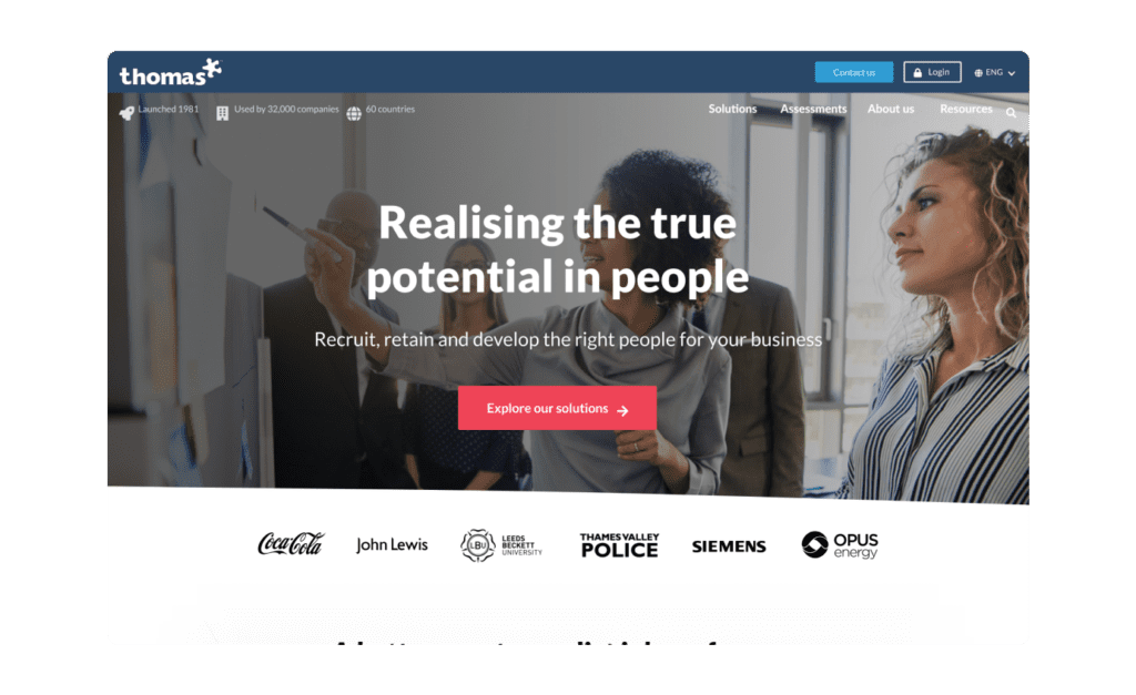


{Social}
